Opinion #1: original printings are always more inspired than reprints. Obviously.
Opinion #2: Reprints always have an “off” feeling to them. I’m not sure what it is, but something always feels odd.
Not the reprint uses a less yellow/more orange ink, has less sparkle in the gold print and appears slightly muddy.
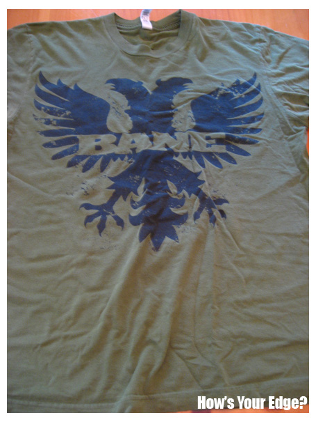
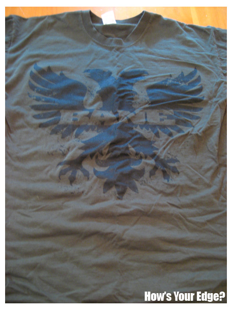
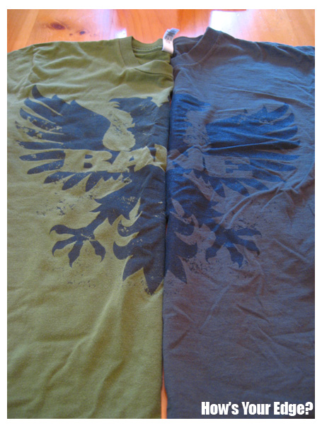
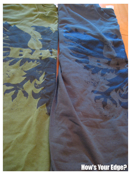
I call this the Iron Eagle tee. I’m sure someone else has a different name for it. Who knows. Anyway, you can see the differences. They are very subtle, but they exist. First off, the shirts are completely different brands and qualities. The original is on an American Apparel tee, while the reprint is on a Hanes tee. Nothing new or terrible about that. I’m sure it happens all the time. Printers probably use whatever tees they have available in the specified color given. I’m can’t imagine there is a big push for “baby puke green” american apparel tees.
As for the screens, the prints are just slightly different. It could be the amount of ink used per shirt, or they could be different screens. I’m not 100%. But if you view the reprint, you’ll notice more well defined black areas. And it appears “less vintage,” less pitted and spotted. Again, this could be the ink amount, but I feel it loses a little of that original appeal.
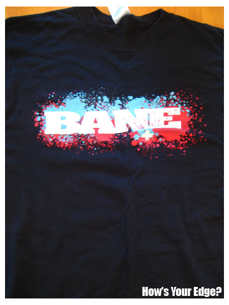
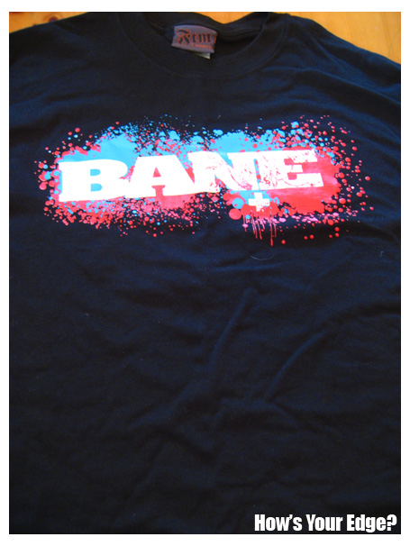
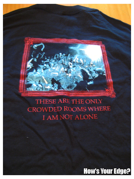
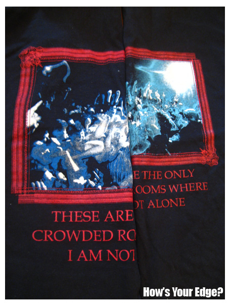
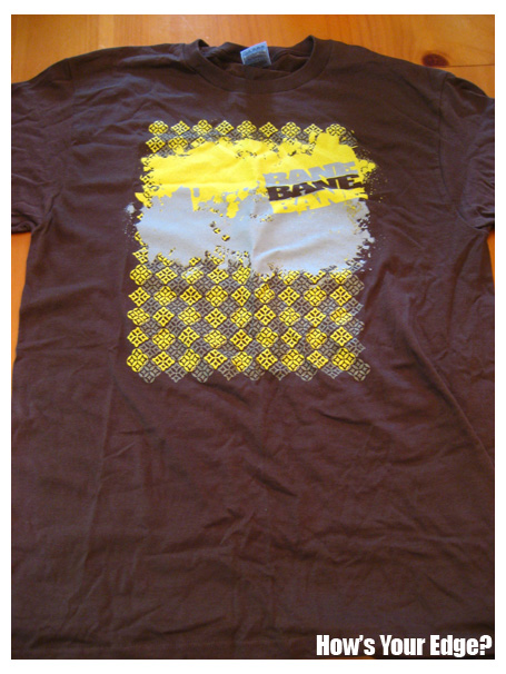
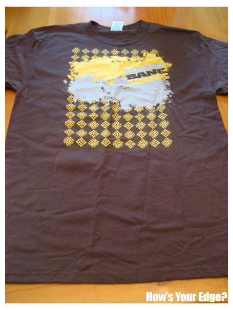
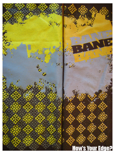
The crowded rooms tee is the most noticeable and obvious reprint situation. Actually, the reprint shirts came from the Australian tour. I suppose it was probably cheaper to have some shirts printed in Australia then to lug them 2000 plus miles and pay all the fees associated with brining in merch.
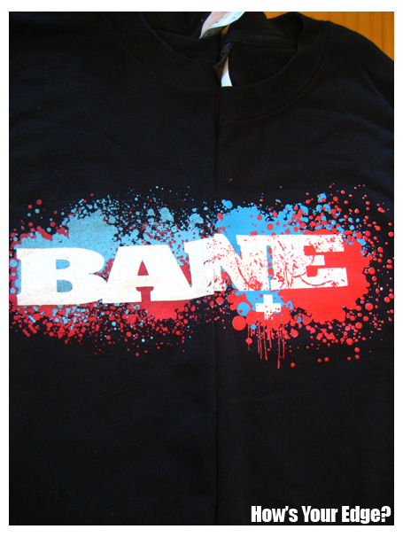
However, the reprint does the tee an injustice, I think. While the inks used on the front are bright and vibrant, they seem to detract from the gritty “give blood” splatter logo vision. The ink is also much thicker on the front giving it more of a Nickelodeon “Double Dare” feel then a hardcore tee.
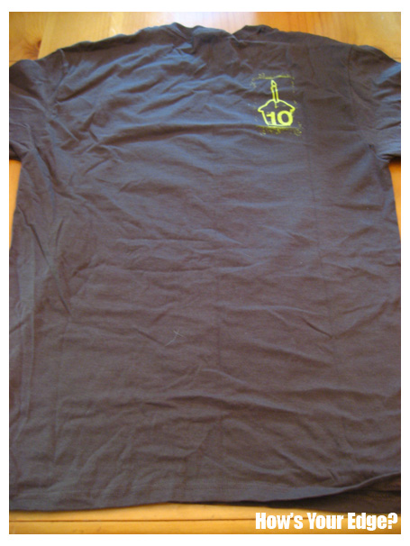
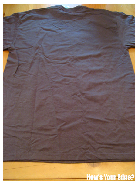
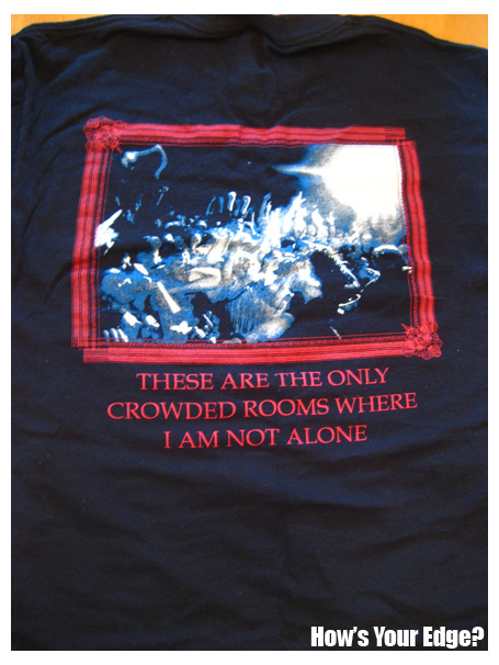
The back side is the major injustice. The image has been shrunk to the point where everyone pictured appears to be a smurfy blur. I’m not saying the original image was crisp and brilliant, but the sense of what was going on is visible in the original image. The reprint — not so much.
There you have it. I’m sure I missed a few subtleties that a reader or two will notice. Feel free to clue me in. And in conclusion, for bands: just make new designs. Kids love fresh new shirts. I know sometimes it is hard to make a new design during the middle of tour, but that’s why you have friends back home or anywhere on the globe. Get them to whip something up, don’t dig into the back catalog unless the design is classic.
That’s all for today. I hope you enjoyed the pics and discussion.